Thursday, June 3, 2010

Emphasis Reflection

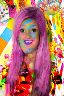
1. three things that i like about my project are the colors. I like how vibrant they all are very vibrant and colorful. I also like the way the two thick lines go under the pink ones. I like that they turn into different colors from eachothers. I also like how the stars have texture and get from small to big in the picture. They are aesthetic concerns because they are all inviled with the artistic side and feeling of it.
2. I would give myself eith a B+ or A-. I think that i would get that because i accoopmlished most of the aspects of the project. I think it looks just a little bit to simple though. \
3. My biggest sruggle of this project was making the eyes look in the right direction. it kept going the wrong way or i would have different object going a different way.
4. the area i would need imporvment is the dirrections. And i think there are a couple objects that look almost a little boring. i think i could have turned the pink stripes into something crazier.
5. i used color contrast. But i used the placement skill the most. i made bigger objects into smaller and leading the eye into different different directions. the area that i want to lead them into.
6. the technical skills that i used the most was differnt brushes. i have a lot of different textures in the object which keeps it different. there are many different technical skills that i used.
7. i used line shape with the pink lines going verticle. this makes the eye move fast up and down on the artwork.
8. i made circles go from side to side and using that it would move the eyes into that direction.\
9. i made bigger and more abstract objects to make the picture move slower. this makes the eye look at it more closely and change directions insread of just going straight up and down.

Final Reflection

1. The most difficult part of this stage of the project was to try in visualize something completly different. It can be a huge challege to think of something so weird and make yourself look so odd and different.

2. The aspect that i would need to work on the most was making it look natural. Sometimes the picture would just look sort of off. I needed to work on making it look like that is how my face has always been. The blending of the new part was a great challenge for me.

3. The thing i like most about my first monster face is the chin. I like it because i think it looks funny. I like the way the rest of the face would look around that chin. It seemed like once i added that everything else started to fall into place. I also like the top of my head. I made it go up a higher in the back, but i think it is kind of cool because it is suttle.

4. My greatest accomplishment of this project was making the chin blend in. It was really hard to make it fit and look normal with the rest of my face. It would look very out of place and you could see every area that needed to be blended, where it was added to. It took a long time to make it blend in.

5. I created a bending and twisting of space with my shoulders. You can hardly notice it, but i took a different angled pictures shoulders to the picture. The body should really be sideways facing a different direction. Instead it is facing forward which is different to the bending and twist spaces.


1. In my artwork i was trying to communicate that joyful and happy attitude. The picture takes place in Candyland. Who could be unhappy in candyland?! I chose to have it be in candyland because i thought all the colors would be fun and i do love candy. I thought it would be fun to have characters in it and make me on the board. I am very happy that i chose to do a candyland theme.
2. My biggest struggle with monster face two was the shirt, arms, and chin. I could not find a shirt or pattern to use for it and kept having problems with it. The arms would just be gone all of a sudden and i could not figure out what to do to fix it for a long time. And the chin would be different colors and very transparent. I could see what was behind it and ut got very annoying.
3. I think my biggest accomplishment was the face. I made the skin into a lollipop which added to the entire theme of the picture. I also turned the eyes green which i thought looked cool. The i made the lips into a dark pupleish color. I had them at their orginal color for a long time, but i figured that i was probably just finished eating some sort of candy so my lips should be a different color.
4. I think my final grade should be an A. I think this because i think it was a very original idea. I don't know of anyone else with a candyland theme. I also think that i accomplished the aspects of the project. I made it into something very original, i added characters into the backround. I turned my face into a lollipop with green eyes and purple lips. I made my hair pink with a jelly bean neck. I spent a lot of time working carefully on it. I am very proud of the way it turned out.

Thursday, April 8, 2010

Project questions


1. Three things that i like about my artwork is the way i used the smudge tool. i like how it brings all three shapes and connects them in a way. I secondly like that way my primary looks like a sun type of thing. i think it makes it pop against the blue backround. Lastly i like the way the secondary starts to come into the primary. i thinks it almost looks like a comet blowing out of or away from the sun.

2. For the project i would grade myself with an A-,i would give this to myself because i think that i accomplished the aspects of this project. My aesthetic skill were overally good, exept i think i could have done better with definate vs. indefinate. i thought i covered all of the technical skills. i used many brushes, different opacity, and had many layers for my different shapes. i thought it ended up with depth and has a variety of different aspects.

3. My biggest struggle with this project was to remember to use different layers. i had a hard time remembering to use different layers for each new thing that i would create.

4. One area that i could use improvement in is the blending. i think that i have gotten better at this as the project went on, but i still need to get a lot better at it.

5. Aesthetic skills that i learned are how to create color contrast with dark and light shades of things to make them pop. i learned that the bigger something is most likely the more attention it will get. i also learned that shapes with harder edges create more attention then shapes that are more blurred. I never knew that the placement of different objects makes a difference of where someone eyes will most likey look. i used all of these aspects to create a primary, secondary. and tertiary.

6. Technical skills that i learned are all of the different brushes that i could use, and that i needed a different layer for every shape or element that i created. i also learned that the opacity makes such a big difference in the look of the artwork.

Wednesday, March 24, 2010

Blog post #2


1. My primary is in the upper left hand corner. It is the yellow/orange/red object. My secondary is in the right side. it is a light green with a light purple smudges. My tertiary is on the bottom and is a light blue color.
2. I used the rules of emphasis to establish my primary, secondary, and tertiary by applying size, color, and placement.
3. The best part of my artwork is my primary and secondary. i like how the primary almost looks like a sun bursting out and how my secondary almost looks like a comet flying away from it. i like that they interact together and feed off of what they are doing together. i also like how i made them more than just one color. i think it makes the artwork more intersting to look at and different from other things.
4. My least favorite part is my tertiary and how much backround is showing. i feel like my tertiary is just there and not incorperating with the rest of the peice. i also think that there is to much backround showing and visible. it is to dominate looking and i need to find something to do with the bottom part of the artwork.
5. the next step to making that part better would work with it. i have to get my tertiary more involved with the rest. go with the bursting feel that everything else gives off. this will also help me with the backround problem. if i make the tertiary more involved the more backround will be used.
6. i am using blending mostly on my primary but also some on the secondary. the primary goes from yellow to orange to red, all blending together. also with the secondary, the light green and light purple are coming together. i am using variety when i discovered the smudge tool. i have used it to bring the shapes together and add something different to the piece of art.

Tuesday, March 16, 2010

Emphasis

this is an exaple of size. i put three dots, one large one, a medium sized on, adn lastly a very small dot. its a good example because due to the differnce in shape the eye automatically goes to the large dot. even though they are the same color the size make a huge difference.


below is an example of placement. i have three dots and one is in the middle while the other two are on off spots. i think this is a good example because the one in the middle of the picture takes all of the attention. also because even though they are all the same color and hardness it still calls for the attention because of where it is placed.


this is an example of definate vs indefinate. i used a solid purple circle with two other purple circles that are more blurry and unlike the cirlce with a very high hardess. i think this was a good example because from softening the hardness on the other two circels draws the eye to the solid circle. another reason it is a good example is because even thoough all of the colors are the same, we still make it so one cirlce draws all of the attention.


This is color contrast. In my art i used a red background with a dark pink and a off red. the white dot pops off of the red because it is so much different from the red color. i think i was successful because the first thing that i see when i look at this picture is the white circle rather than the other two. i also think it was successful because the two other dot blend in with the red backround.